
 Size: 24×36
 OVERVIEW
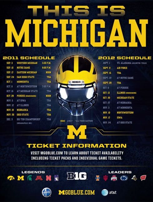
To be honest, 2011 was a complete blur. I designed 143 schedule posters in the calendar year while at Old Hat, not to mention all the smaller marketing materials that went along with them. Michigan was one of our biggest clients at the time, giving us everything under the sea to work on. Life was the bubbles. The same couldn’t be said for the Michigan football team. The Wolverines fired Rich Rodriguez after the 2010 season and hired Brady Hoke to lead the charge in 2011. If they were looking for a spark, they didn’t have to look much further than the electrifying Denard Robinson. And with a whopping EIGHT home games, surely they could (shoe)lace some wins together.
 DIRECTION
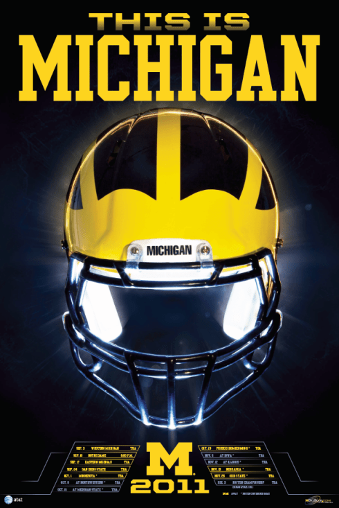
Michigan wanted to go generic and not feature anybody in particular with so many question marks going into the 2011 season. The only direction I remember getting is how they wanted to use “THIS IS MICHIGAN” as their rallying cry – something Hoke said at his introductory press conference. They wanted the brand to be the focal point. And nobody has a bigger, more recognizable brand than Michigan and their iconic winged helmets.
 THE PROCESS
I reached out to the current in-house creatives in Ann Arbor to get some thoughts from an outsider, now insider’s perspective. Ty Rogers, Multimedia Coordinator and recent Emmy Award winner (WHAT?!?) said:
“Simple and clean. Love the text and smaller schedule font at the bottom.”
It’s always interesting hearing what your peers have to say about your work. Especially the ones in charge of creating for the same brand you once worked with. This meant a lot coming from Ty. But how did we get here? This poster doesn’t look that complicated or hard to throw together. As I’m sure Ty knows, sometimes the simplest looking projects take the most time.
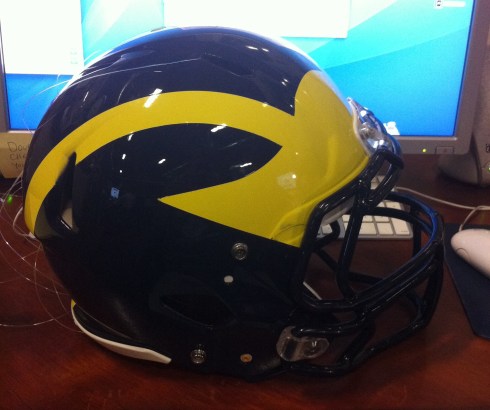
I believe Michigan shipped us a helmet for us to use on this. Once we had the general concept of what we were going to do, it was time for a little photoshoot. Dustin took care of this part of the process, and it sounded like he had a little too much fun. All I remember is hearing how he and some of the other Old Hat fellas set everything up and used sparklers for lighting at his apartment. More on that later. I remember them suspending the helmet with some sort of fishing line so Dustin could get all types of angles on it without anything interfering. This also allowed him to light the helmet from under and inside of it. Once we had the photo it was time to roll on the design.
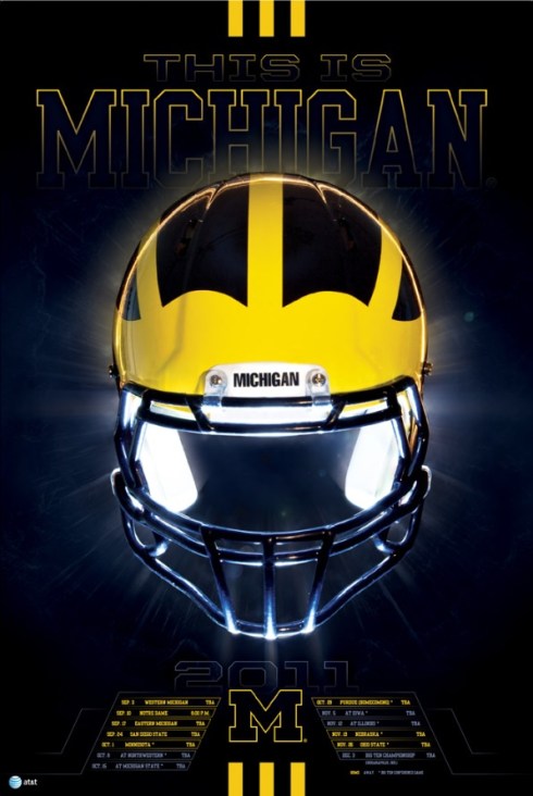
I just used Dustin’s original background instead of their traditional PMS 282 they were using at the time. It was a little darker but it really made the maize stand out. Fitting, because they played their first ever night game at the Big House that year. I wanted to stay with the classic, collegiate look for the header so I went with a couple block fonts – United and Yearbook. United used to be cool, I promise. I think one of the first drafts had a stroke around the header instead of a solid fill. I was trying to make the helmet stand out as much as possible. I even overlapped the helmet on top of MICHIGAN to give it a little depth. All of that eventually got changed on their end. Other elements that were scrapped were some stripes bookending the top and bottom of the poster. They were a few years into their Adidas contract and starting to go cray cray with their uniforms so I thought I’d play off of that a little.
For such a simple poster, the helmet and the schedule were a little more complicated.
The schedule was originally formatted more like the credits on a movie poster. Very small and minimal. Similar to what a lot of designers are doing these days. Michigan had other ideas. I’m not sure if we conditioned them in a way up to this point with lots of design elements and busy posters or what. But they wanted more stank to it. Back around that time more was more. Less wasn’t always a good thing. Definitely something we at Old Hat were known for. Almost to a fault. We had that “Old Hat style.” While that can be cool and interesting on some projects, it doesn’t always work on everything. I remember internal meetings where the print team got together and tried to break that trend. I was the guiltiest party there. Stop with the templated posters. It’s like we found a formula, knew it worked and used it on everything. Big header, athletes in the middle and the bottom for the schedule. We had to really make a point to think outside the box. And when we did, it didn’t always fly. One thing we did get away with was using a lighter blue for the away games. White would have stood out more than the maize so it got a little tricky. How to make the away games less prominent but still feel cohesive to the rest of the design. Light blue works because there are similar shades coming off the highlights of the face mask so it fits in compared to going with a gray that isn’t anywhere else in the poster.
The helmet has its own little story. I got everything where I wanted it on the poster and then noticed something funky was going on with the wings. I couldn’t tell what it was at first. Something was just off. After giving it the once over and marking it up with guides I realized the wings on the left were not the same height as the ones on the right. I remember having to go in and work a little photoshop magic to make things balanced.


I spent around 9-10 hours working on this on my end. Editing the helmet photo and building the actual poster(s). We probably did multiple sizes for this one. 24×36, 18×24, maybe even 11×17. That seems like an awful lot for something so minimal. Not sure where all that time was allocated. Maybe opening and saving such a big file.
 TECHNIQUES
Here’s where I defer to Dustin again. On this project I was like the Scottie Pippen to Dustin’s Michael Jordan. Actually, I was more like BJ Armstrong. All I had to do was show up, run a little point, keep the ball moving. Dustin did all the dirty work. We used to do all sorts of blog features like this back in the day. A little insight to our creative process. Between The Layers isn’t anything new. If you’re a sports creative check out his write up on the helmet photoshoot.
 WHAT I LIKE
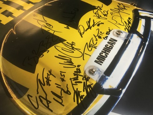
Getting swag from the client to work with in real life is pretty cool. Holding the helmet in your hands, trying it on, watching your entire NCAA Football 14 career flash before your eyes. It was magical. Zac and Dustin went out to Ann Arbor after this was released on another assignment and got some of the players to sign a copy and brought it back for me. So cool.
 WHAT I DON’T LIKE
Knowing what the very first draft looked like is a little frustrating. I try to never blame the client for an idea, no matter how good or bad it may be. So chalk it up to bad execution on my part or the ever-changing, not always pretty design trends. Looking back, I feel like the helmet is at a weird angle. I keep wanting to see more of the inside/back of the helmet. The white pads on the inside that are showing are pretty bright like they’re glowing. Maybe a visor would have helped. None of this is a deal breaker for me. Just some little things I’ve noticed in the seven years since.
 WHY IT WORKS
This is Michigan to the T…errr…M. The helmet is so timeless and you instantly know what this poster is for. What makes it even cooler is how big the poster is. 24×36 aint no joke yall.
 WHY IT DOESN’T WORK
Moving on to all the supporting marketing materials, this one image was forced to fit on a variety of different sizes with a lot more information that didn’t always work well. There was little flexibility.
 FUN FACT
Michigan helmets are yellow with blue paint. I had no idea until I was able to have a close up look. You can see and feel the difference in paint layers. The Wolverines went 10-2, beat Ohio State for the first time in like a bajillion years and squeaked out a W against Virginia Tech in the Sugar Bowl. Awards were won, players were drafted and expectations for 2012 were as high as they could be with Alabama looming in week one.
 BOTTOM LINE
When you have good photographers, use them to your advantage. If you’re using a dramatic photo let it do all the work. Don’t junk it up with unnecessary design. Try not to get stuck in a design routine. Think outside the box. Use sparklers every chance you get. Get lit and burn the joint down trying to make a cool concept.
Ty said it best:
“Love it! Can’t go wrong with the iconic helmet.”
For such a simple, bold, iconic poster, less is definitely more. I think we achieved that for the most part. There are still some things I wish I could have done differently, but I’m pretty pleased with how this turned out. It’s not so much about the design, but the feeling and the impact it had on fans. Most could care less about every little design detail. But the brand recognition and excitement this stirs at a glance is more special than the poster itself. Knowing more than 100,000 fans might have seen this campaign blows my mind. Multiply that by 8 home games and that’s almost a million people. None of them knew what went into shooting and designing this. Again, they probably wouldn’t care either. But as long as they felt connected and a part of their favorite brand, that’s all I could have hoped for as a designer.
A BIG thank you goes out to Ty Rogers for taking the time to share some thoughts on this. And as always, thanks to all of YOU for reading Between The Layers. Stay tuned for more breakdowns of the sports design creative process!
 WHO’S WHO
Michigan Football
MGoBlue.com
@UMichFootball
Ty Rogers
@_TyRogers_
vimeo.com/tyrogers
Old Hat Creative
oldhatcreative.com
@oldhatcreative
Dustin Schmidt
dustinschmidtphotography.com
@photogdustin
Denard Robinson
@DenardX
theshoelacefoundation.org
