 Size: 36×12
 OVERVIEW
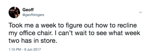
I started working at OU in the summer of 2017 and things were a bit crazy in Norman. Men’s gymnastics won their third national championship in a row right before I arrived. Women’s gymnastics just went back to back. Men’s tennis doubles took down the number one ranked team on their own court to take the crown. Men’s golf brought home the team title. Softball won their fourth natty for Patty, also going back to back. Bob Stoops retired, passing the torch to Lincoln Riley. I finally learned how to recline my office chair. And that was just my first week on the job. So staying busy wasn’t a problem.
As we geared up for football season, we knew we had a good team. But with a new head coach, I’m not sure if anybody really knew what to expect. Little did we know, we were about to have one heck of a journey. Led by Baker Mayfield, OU went 11-1, won the Big 12 Championship, but ultimately lost to Georgia in the CFP Semifinals in the Rose Bowl. Along the way, Baker did what Baker does. Including going from a walk-on at two different universities to winning the Heisman Trophy.
 DIRECTION
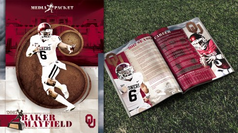
To commemorate such an occasion, we designed a few materials for Baker during his Heisman campaign in December. We also wanted to feature some of these accomplishments at the 2018 spring game. It was decided we were going to put together a few different options for the fans rather than your typical schedule poster. Since we didn’t have the new uniforms yet after the jump to Jordan Brand, we had to keep it pretty generic. We designed a simple poster featuring the returning players and Scott Matthews put together a photomosaic for a salute to Stoops. I think he used more than 2,000 photos (narrowed down from 8,000). I was tasked with creating a poster that featured all six of our Heisman winners using action shots and basic info like name/year and all that. The rest was kind of up to me.


 THE PROCESS
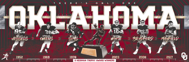
When I first got this assignment I had the idea of doing something similar to a timeline. I thought that would work well since there was such a wide range of dates and I wanted them in chronological order. I went horizontal right away. I tried 18×24 but the wider 36×12 worked better after throwing the basic elements in there. I liked how the players overlapped OKLAHOMA and there wasn’t too much room to fill top to bottom. For the players, most of them were already cutout from previous projects Scott worked on before I started. I just tried to find full body shots that worked well together. I chose to go black and white because two of them are so old they didn’t have color photos. Being able to control the shades on the players makes them all feel uniform and you don’t have to worry about different lighting conditions and shades of red in the uniform from photo to photo. They all more or less look the same now. This also eliminates red unis on a red background and helps them stand out. It gives the poster a vintage feel as well.

I threw the stadium facade in the background. While it’s hard to see, I wanted to include the new south side renovations to show what these guys helped build. Right on top of the Stadium is our new Oklahoma word mark displayed in our new font that nike developed. Scott named it Sooner Born. This is something Sooner fanatic SoonerTracker has been ‘tracking’ since before it was even official. Same goes for the switch to Jordan Brand. I’ve learned about things on multiple occasions that SoonerTracker sniffed out long before it made its way to me. And I work here! If you’re a fan of gear, branding, uniforms, etc…SoonerTracker is a good follow. Even if you’re not a Sooner fan. So the new font has been used in all the football facility renovations and is slowly making its way into our print and digital graphics.
I wanted this to feel older and more historic than the current brand so I added our sparsely used cream color. To tie it back to the materials we did for Baker’s campaign in the winter, I used the same clouds as filler elements. Something interesting and neutral enough in color that adds to the overall feel, but not so far off brand that it’s distracting. The thin line pattern in the background was another element that nike developed for us called the Infinity Pattern. It’s a football specific element we’ve been using on lots of other marketing materials. The wagon wheel in the middle was one of the last additions to the poster. I needed something to fill the dead space on either side of the trophy and the wagon wheel just feels so Oklahoma-y and contributes to the old timey feel. I flirted with the idea of keeping the background full color but it got a little too busy for the ol’ eyes and the players got more lost than the refs on the Oregon Trail.
All that was left were the names and the dates. The divider lines on the timeline don’t necessarily represent points in time, rather hash marks like on the football field. Those tie in with the hash marks running along the bar behind OKLAHOMA. Because, FOOTBALL. Between the names are little arrows that drive home the point of chronological happenings in time. (If I ever have a band, Chronological Happenings In Time will be its name…so don’t steal my C.H.I.T.)
At the end of the day this poster had 99 active layers and a few stragglers that weren’t turned on. The file size was 2.2 GB, but with 64 GB of RAM it didn’t take any time at all to open or save. I had this on my radar mid March, worked on it over the course of a week off and on, had little to no revisions and we sent it to the printer on April 4 for the Spring Game on April 14.
 TECHNIQUES
As I mentioned earlier, I used black and white cutouts of the players. This starts with converting the original cutouts into smart objects before bringing them into the poster file. Smart objects preserve an image’s source content with all its original characteristics, enabling you to perform nondestructive editing to the layer. From there I hit it with a gradient map smart filter. You can copy smart filters from layer to layer just like layer styles. Every single photo, texture jpeg, cutout or imagery I might want to resize, distort or add effects to I’ll bring in as a smart object. That way I know I won’t lose any quality after working it to where I want it in the design. I’ve literally turned tiny web ads into huge print ads because everything was either vector or a smart object. So handy.

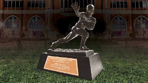
Another technique I used on this was the stock grass brush that comes with photoshop. It’s pretty cheesy but useful when you need a quick fix. We had the trophy photo shot in a studio setting, but I needed it to sit in the grass with all the other players. To achieve that I just used a the grass brush on a layer mask to mask out the hard edges on the bottom of the trophy.
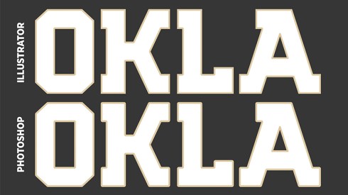
The last really useful thing I did for this poster relates to the OKLAHOMA header. Any time I do large typography with a stroke, I always do it in Illustrator to keep the corners sharp. Photoshop still has those goofy round corners when you use a stroke in your layer styles. You can convert it to a shape in photoshop and use the stroke in the shape toolbar, but I still prefer to do it in Illustrator so there are more options with layering and adding effects to the typography. It’s a little more work but definitely worth it if you have a nice block font. Convert your type to outlines in Illustrator and then go to Object – Path – Offset Path.
 WHAT I LIKE
Born and raised in Oklahoma, this was an honor to work on. Only a handful of schools have a program with this type of success. Getting to be a part of that in any little way is pretty neat. Design-wise, I like how this feels like classic sports memorabilia. It screams history, Oklahoma and football. Personally, I love the color palette. Crimson, cream, shades of black and white with a little natural bluish-gray.

 WHAT I DON’T LIKE
The bar behind OKLAHOMA feels weird to me looking back at this. There are some weird things going on, especially in the “a-holes.” Using the grass brush just feels like a cornball move on my part, but I haven’t really taken the time to find a better way to execute that. I wish I could have brought out the stadium a little more in the background. Unless you know what to look for you’ll completely miss it. “6 Heisman Trophy Award Winners” feels like an afterthought down there at the bottom.
 WHY IT WORKS
It’s pretty self explanatory and you know what’s going on right away. All of the elements either reference football or Oklahoma. For the most part, the poster as a whole feels greater than the sum of its parts.
 WHY IT DOESN’T WORK
Contradictory time. This design already feels dated. And not in a historic, rich tradition good kind of way. I’m talking about the design elements. The “parts” in the sum. The font used for the last names doesn’t necessarily fit with anything else and all the effects and textures in the cream elements are almost cliche in the design game now. There’s not much originality to the design compared to what everybody else in the industry is doing. It almost feels over-designed with clutter. If you take the layout of this literally, why would the players be playing outside of the stadium? Just a little design flaw.
 FUN FACT
We printed 10,000 copies of this poster. I believe we also did 10,000 for the team poster and at least 5,000-10,000 of the Stoops poster. The Heisman Trophy in the middle was originally Sam Bradford’s. I photoshopped it to be Baker’s since we didn’t have any photos of his yet.
 BOTTOM LINE
Mission accomplished. I feel like we put together a halfway decent poster that exemplifies what we have here at the University of Oklahoma. Sure, I wish I had a few mulligans on this one, but that goes for literally everything else I do. From a designers point of view, I would say always look to be efficient. Not everybody’s way will be the same, and that’s okay. Find what works best for you. Work smarter, not harder. Find ways to grow and learn the technology you’re using every day. I’m still learning new things to this day. Learn the culture as well. I think Mark Majewski said it best. Tell your story. Get to know your brand, stay true to it and always be aware of what’s under your a-holes.
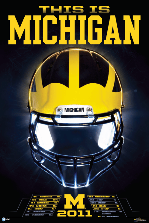
Thanks again for reading Between The Layers. Stay tuned for some interesting facts about the 2011 Michigan Football poster, with insights from a special guest!
 WHO’S WHO
Oklahoma Football
soonersports.com
@OU_Football
Baker Mayfield
@bakermayfield
Scott Matthews
catchingdesign.com
@catchingdesign
SoonerTracker
@SoonerTracker
medium.com/@SoonerTracker
Mark Majewski
@markmajewski
