 Size: 36 x 24
 OVERVIEW
2008 was an interesting time to be a graphic designer in athletics. The internet was big enough to think you knew everything, but small enough to not know anything. Agencies like Old Hat Creative and Summit Athletics had a stronghold on the design game. Very few schools had quality, experienced in-house designers at their disposal. Smart phones were barely a thing. MySpace and Facebook ruled social media. Twitter only had about 6 million users. To put that in perspective, Flo-Rida almost has that many followers himself now. From my point of view it was basically impossible to connect with other designers in your field, much less see what they were designing.
There were random message boards and sites like WCRemix where people did designs for fun, but nothing like what we have now. Long before Poster Swag, SkullSparks and Trenches (thanks for all that you guys do!) there was a site called The Wiz of Odds. It was the only way I ever saw other posters from people in similar positions as myself and Old Hat Creative. It appeared to be a blog or personal website of sorts, collecting, organizing and ranking football posters from schools around the country. They even had people reviewing each poster design, and let me tell you, some of them weren’t pretty.

Florida State was still a power player in college football, although the SEC reigned supreme in the BCS era. To change that, Florida State realized it was time to push the limits of their marketing materials to boost recruiting, amplify the fan experience and change the design landscape for years to come.
 DIRECTION
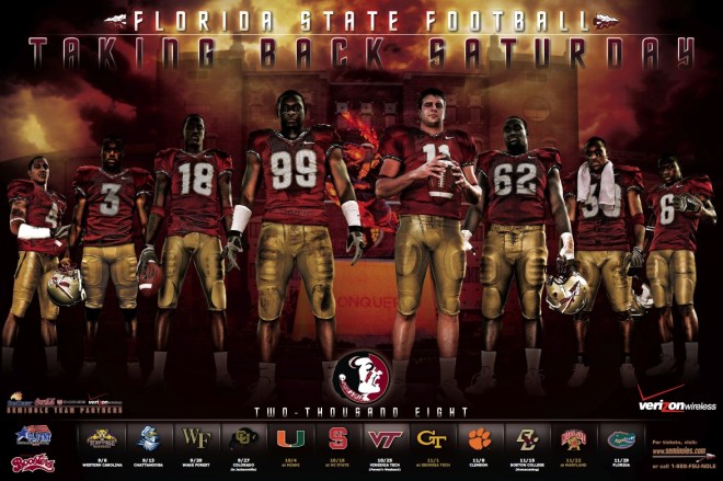
I had been at Old Hat for 6 months when Zac Logsdon walked over to my desk and told me I was in charge of designing the FSU football poster. This was a big deal. To my knowledge, Zac was the only one who had the responsibility of designing such a big poster for such a big client. It was probably the highest profile project we had at the time. Right after abusing the intern . And when the owner of the company gives you the keys to the flashy company car it’s a little intimidating. Then he told me it had to be the best thing I had ever designed. No pressure, right? And if you look at the best thing I had done up until that point, it shouldn’t have been that hard. But the pressure was on, the nerves were there, and now it was go-time.
The direction from our contacts at Florida State were pretty simple. They wanted to get away from action shots that they had used in previous years and use posed photos instead. They wanted to go bold and do something that had never been done at the college level. A Gatorade ad made its way to me and I was told to go off that as inspiration. This was a big shift compared to what the industry was putting out at the time. Everything was pretty cheesy and full of silly themes or colorful shapes with taglines that were a little over the top. They wanted real, raw and tough. Looking back, I would compare it to wrestling in the mid 90’s. Most of the industry was stuck in the cartoonish WWE, while FSU wanted to turn heel in a major way and form the nWo of graphic design. The design attitude era had just begun.
 THE PROCESS
If I remember correctly, Florida State snail-mailed us a handful of DVD’s with hundreds of photos on them from Tallahassee to Norman, Oklahoma. This was before the internet had really mastered file sharing. From there, it was just a matter of putting a poster together.
We had photos of the stadium from projects Zac worked on in previous years. After digging through those I settled on the one from outside of Doak Campbell Stadium with the Unconquered statue taking center stage. I thought it would make a cool backdrop for the poster. I remember working way too long on adding the clouds to the design. I wanted them to be rolling over the stadium like a scene from a horror movie. It was tricky working with FSU’s colors because red and yellow (garnet and gold) tend to make orange when mixed together.
The players were added and arranged in an order I’m sure the client told us about. They were all individually shot so we had to keep in mind player height, spacing, and making sure nobody was overlapping weird. To make things more dynamic, we scaled them in such a way to build depth, add dimension and perspective. Impact players up front. Supporting roles towards the back. Which is hard to do at Florida State when everybody has crazy talent. They might have even left some guys off after dealing with suspensions. They mentioned they wanted everybody to be doing something different or have their own unique pose/prop. Some holding footballs, others with helmets, one guy with a towel. I don’t remember having to switch photos a lot for this one so we must have done something right. One of the first revisions they had was to space the middle two players out more so you could see the statue between them. I think at some point they wanted us to add fire to make it more noticeable.
For the header, I think we had either Florida State Football or the tagline at the bottom above the schedule at first. I’m not sure if we moved it during internal revisions or if the client changed that. In doing so, it left a weird empty space I tried to fill by spelling the year out. Something they liked and continued to do for years down the line. “Taking Back Saturday” was something Florida State came up with, although I’m not exactly sure why or what it even meant back then considering they had at least one Thursday game that year. I guess they wanted to get back to their winning ways. The font was a Star Trek knock off called Federation or something like that. For some reason it felt Native American to me.
One of the comments I heard the most about this was how people had never seen the schedule arranged on a poster this way. That couldn’t be true because I had seen my fellow Sooner fan OUKingpen doing that for fun on his own desktop wallpaper designs. The first draft of the schedule didn’t have any way of differentiating home and away games so I added a little highlight behind the home opponent logos in the background. They said as long as we didn’t make anything orange like the University of Florida it was all gravy. And in the south, gravy is worth its weight in gold. Stick around long enough and that line will be worth the wait. I’d say nearly half of the scheduled opponents and even Florida State themselves got logo refreshes since then.
Back in the day, sponsors got to take up their fair share of real estate. I can’t tell you how many times we were told to make the sponsor logos bigger. For the bigger sports, Florida State usually ran the same poster with as many as half a dozen sponsors getting their own version. In years to come, they started having different players on the poster with different sponsors. Most of the schedule and all of the corporate mumbo-jumbo was laid out in InDesign, while the bulk of the design and special effects were done in photoshop. This is so you don’t have to open large photoshop files to make small text changes.
All-in-all we probably spent 18-20 hours on this poster. And while I can’t tell you what we charged, let’s just say this was more over budget than Jimbo’s A&M contract. However, not all of that was design time. For a 24×36 inch poster file flirting with 4 GB, a dinosaur of a computer with only 2-4 GB of RAM and a designer who didn’t have a clue what he was doing, I probably spent a couple hours total just opening and saving this file. We went on to repurpose this design for all the supporting marketing materials such as tickets, schedule cards, magnets, etc…


 TECHNIQUES
This is where Dustin Schmidt comes in. Dustin was (and still is) Old Hat’s design/photography guru extraordinaire. He knows how to really adjust, color correct and add effects to high quality images like the ones that were provided for this project. He added all the effects to the players before I brought them into the poster file. I believe he used camera raw to adjust the sliders and then a technique similar to dodging and burning in photoshop. Every highlight and every shadow was manually brushed out and amplified by Dustin. He really brought life into this poster with such high contrast and intriguing effects. I learned so much just watching him work on a few of these players. Hardly anybody was really taking time to color correct their photos for posters at the time, including me, and seeing what cohesive photography looked like really changed how I treated my photos from that point on. Dustin, you da real MVP of this one.
 WHAT I LIKE
After designing more than a thousand posters in my career, this is still tops my list of favorites. Mainly for personal reasons. The trust and responsibility given to me, the challenge of pushing myself to be better than ever, the history and tradition of such a big program like Florida State. This poster single-handedly jump-started my career and sent me on a journey that I didn’t even know was possible.
 WHAT I DON’T LIKE
The sky got a little muddy. I’m not sure how I built everything, but it could have been executed better. All the clutter at the bottom really knocks this down a couple notches. The sponsor logos distract from the poster as a whole. Some of the jersey numbers I could have brightened up to be more consistent across the board.
 WHY IT WORKS
At the time, this poster didn’t look like anything anyone had ever done for college football. If you strip down all the dated design elements, I feel it could still hold its own in today’s game. It was truly ahead of its time.
 WHY IT DOESN’T WORK
Like Mike said, this poster was a bit on the dark side. It printed even darker. It’s hard to make out some of the faces and the “Unconquered” statue engraving is hard to make out unless you know what it says already. One of my pet peeves. Overlapping text with players so entire letters of the word are eclipsed out, often times leaving incomplete/random new words remaining visible.
 FUN FACT
Florida State school colors were garnet and gravy before officially changing to garnet and gold in 1905. Just kidding. Gravy, gold, worth the wait. The big pay off, right there. Even more interesting is the fact that #3 Myron Rolle had a mix up somewhere along the way and wasn’t at the photo shoot or something because I remember getting his photo and it was shot at a different angle and his pants weren’t the same as the rest of the players. They were more of a matte instead of the shiny material. We also had to photoshop the front of his pants because his “Rhodes Scholar” was a little too noticeable. The Noles went 9-4 (5-3 in conference play) and blew out Wisconsin in the Champs Sports Bowl. #99 Everette Brown was drafted 43rd overall in the NFL draft by the Carolina Panthers and went on to donate exactly 0 bucks to me for my efforts on this poster. Maybe Dustin got a cut.
 BOTTOM LINE
This poster changed my life. I will forever be thankful to Zac for taking a chance on a kid with no experience, trusting me to do that voodoo that I do and letting me grow into the designer I am today. This was more than a design for me. More than an “edit” as the kids say today (stop it btw). More than a poster for some tyke in Tallahassee to hang on the wall. This was an opportunity. Sure this poster was too legit to quit in 2008. It was ripped off many times after it dropped. There were also some not so good things. Things I learned from and tried not to repeat. And there were definitely some player haters named Mike who didn’t like anything about it.
So to all the designers out there, keep grinding. You never know when your big break will come. Just when you think you’ve made it big, try to go bigger. Treat every project like it’s the most important one and ignore the haters like Mike. Be thankful we can all network online now and strive to be the design community that so many of us never had. And just for the record, Bobby Bowden retired a year later and I went on to design 5 more Florida State football posters. Old Hat is still doing them as far as I know. In 2013 the Seminoles won it all and I’d like to think that this little poster brought in the recruits that developed into national champions. Maybe? Not likely. Just like Mike’s hopes and dreams regarding me and this poster.
If you’ve made it this far I can’t say thank you enough for reading Between The Layers. Coming up next time, we’ll take a look at what went into the 2018 Oklahoma Heisman Poster.

 WHO’S WHO
Florida State Football
seminoles.com/sports/football
@FSU Football
@FSU_Recruiting
Old Hat Creative
oldhatcreative.com
@oldhatcreative
Zac Logsdon
@zaclogsdon
PosterSwag
sportposterswag.wordpress.com
@PosterSwag
SkullSparks
skullsparks.com
@skullsparks
@JasonRMatheson
Trenches
trenches.online
@trenches_
OUKingpen
oukingpen.com
@oukingpen
Dustin Schmidt
dustinschmidtphotography.com
@photogdustin
